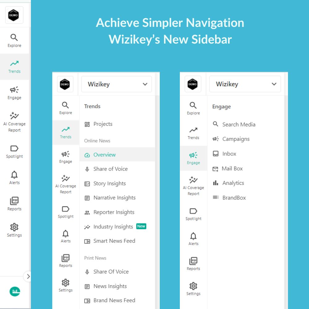
At Wizikey, we’re always listening to our users and striving to enhance your experience. After receiving valuable feedback, we’ve taken a hard look at one of the most essential parts of the platform—our sidebar. We’re excited to announce that next week, we’ll be rolling out a brand-new sidebar designed with you in mind!
Why a New Sidebar?
We’ve all been there—clicking through endless menus, hunting for the right charts, or getting confused by sections that opened or closed unpredictably. Navigating the platform could sometimes feel like a chore. We knew something had to change, so we went back to the drawing board to create a sidebar that is not only easier to use but also helps you get to the insights that matter with fewer clicks and zero hassle.

What’s Changing?
Our redesigned sidebar offers a cleaner, more intuitive experience:
- Streamlined Navigation: No more cluttered menus—everything you need will be right at your fingertips.
- Fewer Clicks, More Action: We’ve reorganized the layout so you can find your favorite charts and features without the extra steps.
- Sleek and Simple Design: A modern look that helps you stay focused on the data, not the navigation.
With this update, we want to make sure you can get in, get what you need, and get back to strategy faster than ever.
We Want Your Feedback!
Before we officially launch the new sidebar, we want to hear from you! Is there anything specific you’d like to see in the new design? Your insights will help us fine-tune the experience and ensure it’s the best possible fit for your needs.
What’s Next?
The new sidebar will go live next week, so keep an eye out for the update! In the meantime, if you’d like a sneak peek or have any questions, feel free to reach out to our team. We’re always here to guide you through the changes.

